September 16, 2014
Ebola Chart 3
by
Paul Conton
Ebola Chart 3
by
Paul Conton
Our Ebola chart, originally
introduced in Chronology of the Ebola Outbreak in West Africa (
https//www.natinpasadvantage.com/Sierra_Leone_Health/Chronology_of_the_Ebola_Outbreak_in_West_Africa.html
), is
continued, with data points for all three countries taken from the WHO
updates of confirmed cases up to September 2, 2014. In addition,
trendlines are introduced for all three countries out to the end of the
year.
Epidemiologists have developed sophisticated computer modelling techniques for predicting the course of an outbreak and the likely effects of various interventions. For our purposes we are looking for a simple technique to predict the likely expansion of the outbreak if it continues at its present rate (ie if nothing happens to change the rate of expansion) and to assess the impact of any public health interventions in individual countries. For instance, we would expect to be able to see the impact of the forthcoming three-day lockdown in Sierra Leone in the charts in the coming weeks. One would expect to see a spike in the number of cases, as new cases are discovered by the outreach teams.If these discoveries are significant in number, they should eventually, assuming proper isolation and contact tracing, lead to a reduction in the number of new cases being reported. So the trend of the graph should change in coming weeks, perhaps increasing in slope and then declining.
The trendlines are developed using Microsoft Word's TRENDLINE feature and choosing the equation that gives the best fit to the existing data. This equation is then plotted out to the end of the year. For Sierra Leone, the selected equation fits the existing data very closely, giving some confidence that the projection out to the end of the year is accurate. As mentioned earlier this projection tells us what would happen if nothing happens to change the current characteristics of the outbreak.
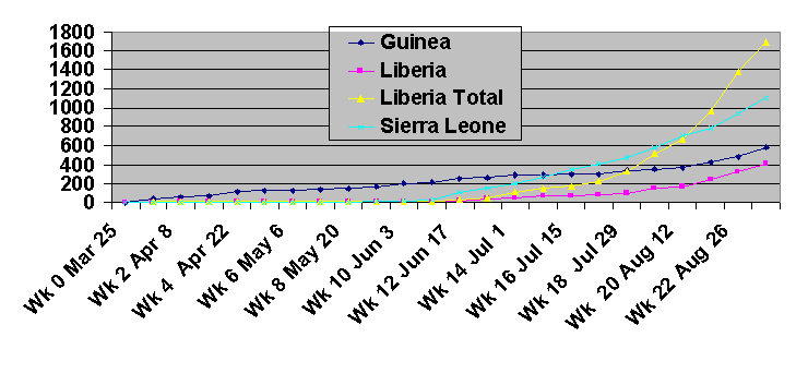
The chart above shows lab confirmed cases for all three countries as reported by WHO in their regular updates to Sept. 2. For Liberia, total cases are also plotted, as a large percentage of Liberia's cases have not been confirmed by laboratory analysis. The chart shows the very rapid rise of Liberia's cases to outstrip those of the other affected countries.
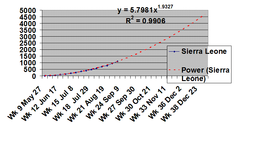
This chart gives the trendline for Sierra Leone to the end of the year, using the equation that best fits the available data. The R2 number indicated in the chart is a measure of how closely the equation fits the actual available data. When R2 is equal to one the fit is perfect. In this case a value of 0.99 indicates a very good fit, giving some confidence that the trend indicated is accurate. The trendline shows that by the end of the year, if the outbreak remains unchanged, Sierra Leone will have approximately 4500 lab-confirmed cumulative cases. All numbers are for laboratory-confirmed cases and do not include the probably substantial number of unreported cases.
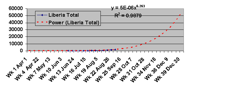
This chart shows the best-fit curve to Liberia's existing data. It projects around 50,000 cumulative cases in Liberia by the end of the year. At 0.9879 the fit is not quite as good as in Sierra Leone's case. Moreover, the very rapid expansion in forecast cases, from a relatively low actual base, leaves a large amount of room for error in the forecast. Accordingly, we plot a different scenario for Liberia below.
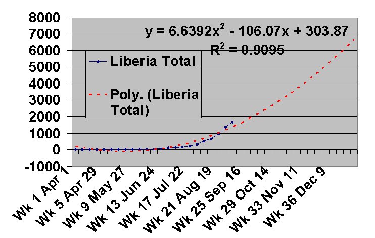
This chart is plotted for Liberia using a polynomial trendline rather than the power series trendline shown earlier. The R2 value is substantially lower than previously, indicating this trendline does not so closely match the existing data. In this less-pessimistic scenario, Liberia will have approximately 7,000 cases by the end of the year.
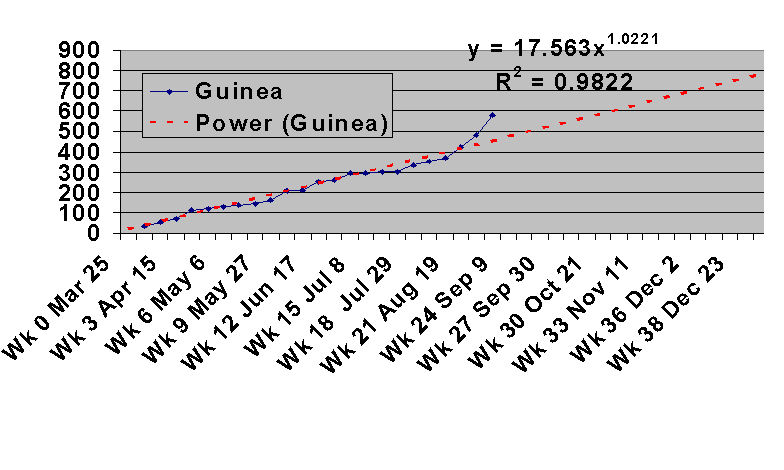
The chart above plots the trendline for Guinea. At 0.9822, the R2 coefficient indicates more deviation from actual data than in the Sierra Leone case, and this can clearly be seen in the data points on the chart. The trend indicates Guinea will have about 800 cumulative lab-confirmed cases by the end of the year, although the trendline perhaps does not give sufficient weight to a substantial increase in cases from Guinea in recent weeks.
Conclusions: As the weeks pass these trendlines will be compared with actual WHO data and should help to indicate whether we are winning the battle against Ebola or not. They should also help us to evaluate the effectiveness of specific Ebola control measures, such as the three-day lockdown in Sierra Leone.
Epidemiologists have developed sophisticated computer modelling techniques for predicting the course of an outbreak and the likely effects of various interventions. For our purposes we are looking for a simple technique to predict the likely expansion of the outbreak if it continues at its present rate (ie if nothing happens to change the rate of expansion) and to assess the impact of any public health interventions in individual countries. For instance, we would expect to be able to see the impact of the forthcoming three-day lockdown in Sierra Leone in the charts in the coming weeks. One would expect to see a spike in the number of cases, as new cases are discovered by the outreach teams.If these discoveries are significant in number, they should eventually, assuming proper isolation and contact tracing, lead to a reduction in the number of new cases being reported. So the trend of the graph should change in coming weeks, perhaps increasing in slope and then declining.
The trendlines are developed using Microsoft Word's TRENDLINE feature and choosing the equation that gives the best fit to the existing data. This equation is then plotted out to the end of the year. For Sierra Leone, the selected equation fits the existing data very closely, giving some confidence that the projection out to the end of the year is accurate. As mentioned earlier this projection tells us what would happen if nothing happens to change the current characteristics of the outbreak.
The chart above shows lab confirmed cases for all three countries as reported by WHO in their regular updates to Sept. 2. For Liberia, total cases are also plotted, as a large percentage of Liberia's cases have not been confirmed by laboratory analysis. The chart shows the very rapid rise of Liberia's cases to outstrip those of the other affected countries.
This chart gives the trendline for Sierra Leone to the end of the year, using the equation that best fits the available data. The R2 number indicated in the chart is a measure of how closely the equation fits the actual available data. When R2 is equal to one the fit is perfect. In this case a value of 0.99 indicates a very good fit, giving some confidence that the trend indicated is accurate. The trendline shows that by the end of the year, if the outbreak remains unchanged, Sierra Leone will have approximately 4500 lab-confirmed cumulative cases. All numbers are for laboratory-confirmed cases and do not include the probably substantial number of unreported cases.
This chart shows the best-fit curve to Liberia's existing data. It projects around 50,000 cumulative cases in Liberia by the end of the year. At 0.9879 the fit is not quite as good as in Sierra Leone's case. Moreover, the very rapid expansion in forecast cases, from a relatively low actual base, leaves a large amount of room for error in the forecast. Accordingly, we plot a different scenario for Liberia below.
This chart is plotted for Liberia using a polynomial trendline rather than the power series trendline shown earlier. The R2 value is substantially lower than previously, indicating this trendline does not so closely match the existing data. In this less-pessimistic scenario, Liberia will have approximately 7,000 cases by the end of the year.
The chart above plots the trendline for Guinea. At 0.9822, the R2 coefficient indicates more deviation from actual data than in the Sierra Leone case, and this can clearly be seen in the data points on the chart. The trend indicates Guinea will have about 800 cumulative lab-confirmed cases by the end of the year, although the trendline perhaps does not give sufficient weight to a substantial increase in cases from Guinea in recent weeks.
Conclusions: As the weeks pass these trendlines will be compared with actual WHO data and should help to indicate whether we are winning the battle against Ebola or not. They should also help us to evaluate the effectiveness of specific Ebola control measures, such as the three-day lockdown in Sierra Leone.
Related...