Dec 8, 2014
Ebola
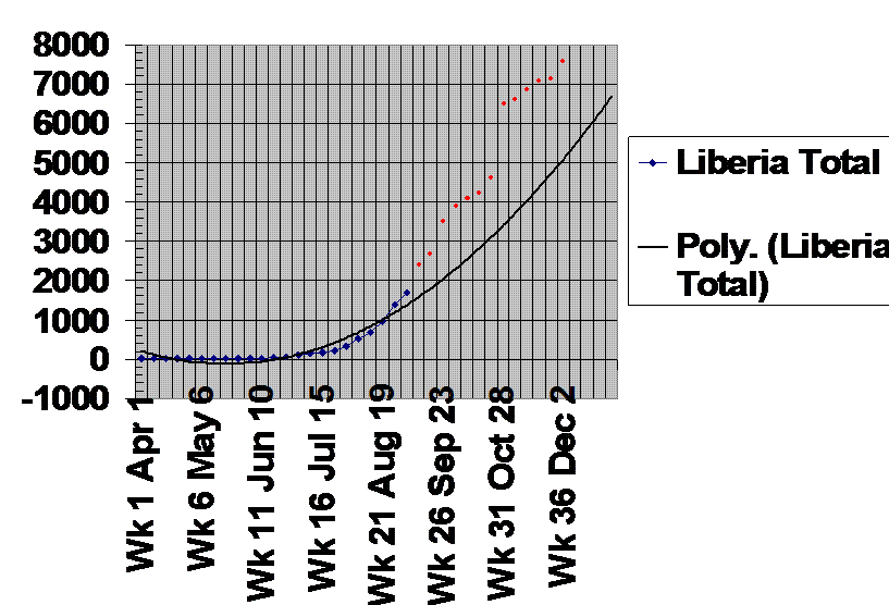
Chart 5The plots for Sierra Leone and Guinea reflect laboratory confirmed cases of Ebola only. For Liberia, however, because initially many cases were not confirmed by lab test, the plot is of total cases, comfirmed, probable and suspect.
Trend lines were developed in Ebola Chart 3 to predict the course of the outbreak in each country up to the end of the year. The trend lines were developed using data up to Sept. 2. These trendlines are reproduced here, but with the new data points since Sept. 2 included. The trendlines shown are the original ones and have NOT been recomputed using the new data.
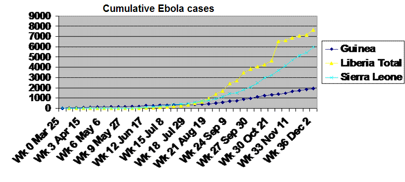
The chart above shows the continued increase in Ebola cases in the three worst affected countries. The chart reflects the continued intense Ebola transmission in Sierra Leone, and the recent relative slowing of transmission in Liberia. If the trend continues, Sierra Leone will overtake Liberia in cumulative cases. The chart shows Liberia total (suspect, probable and confirmed) cases, whilst only confirmed cases are plotted for Guinea and Sierra Leone. This is because of inadequate testing capacity in Liberia at the start of the outbreak. The jagged nature of particularly the Liberia curve, reflects problems with data collection and assessment rather than actual variations in infection rates.
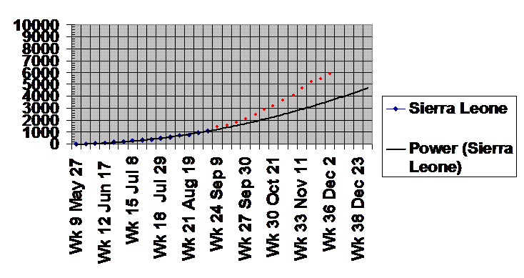
The chart above shows the trend line computed on Sept. 2 for Sierra Leone and the actual data points collected since then. The new data shows that Sierra Leone's infection rate has consistently exceeded the trend predicted on Sept. 2.
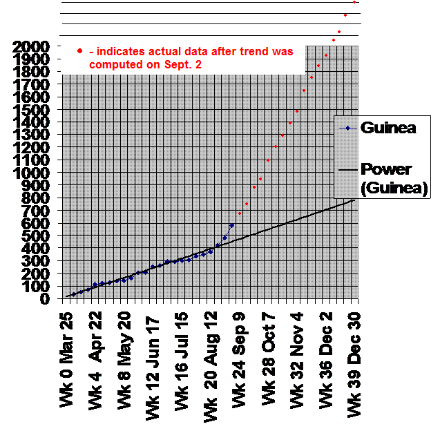
The chart above shows the trend line computed on Sept. 2 for Guinea and the actual data points collected since then. The new data shows that Guinea's infection rate, while still lower than the other two countries, has exceeded the initial early trend.